Power BI heatmap capabilities of Microsoft’s gold partners can enhance your business presentations and empower your company’s conversions and activations.
Think beyond code colors, pie charts, line charts, and bar graphs by presenting your data with real-time, interactive visuals. Real-time business intelligence enables leaders to make effective decisions that expand company outreach.
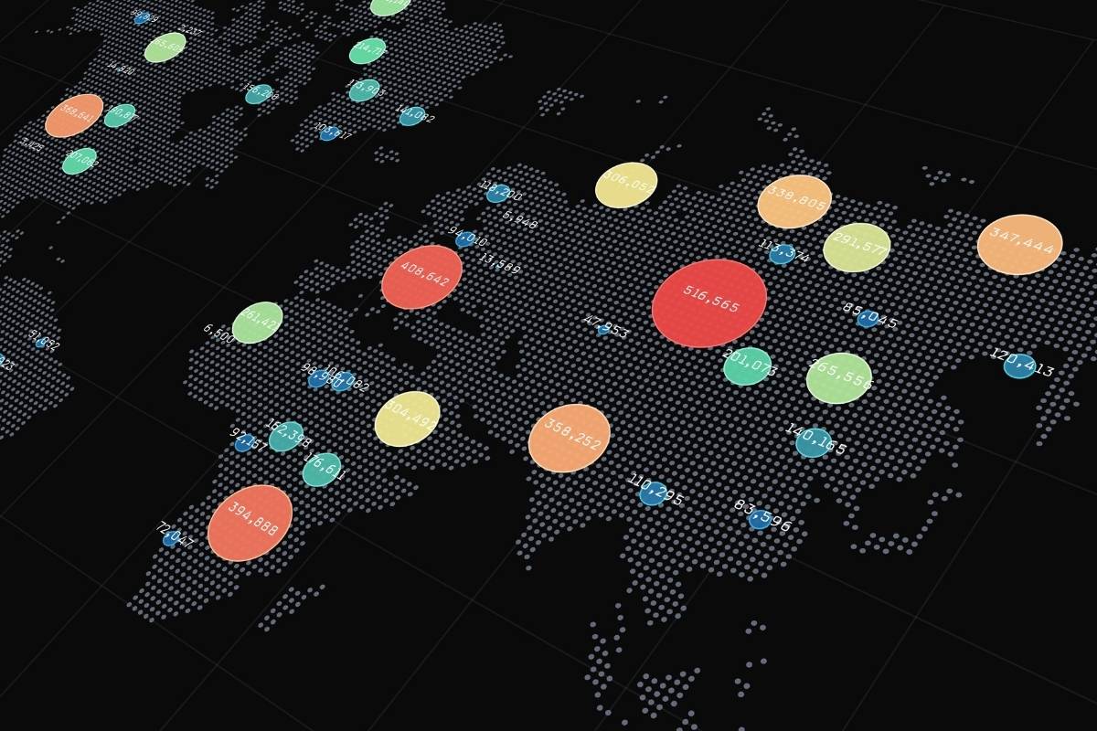
Interactive business intelligence visuals such as Microsoft’s Power BI Heatmaps help business leaders paint a clear picture of what is happening within your company and your impact worldwide.
Bring Your Data to Life with Power BI Heatmaps
Microsoft Power BI is a collection of services and apps that work together to transform massive amounts of unorganized data into clear, visually appealing, and interactive insights. Power BI allows you to effortlessly connect your data sources, visualize what is important, and share information with anyone you want.
Organizations can leverage Power BI’s data visualization tools to transform information into actionable intelligence. Users can communicate information to various departments, managers, vendors, and investors in an intuitive format to you and your company. You can bring your data to life with a preloaded template or browse Microsoft AppSource, a business app store that serves as the marketplace for Power BI custom visuals.
Power BI Heatmap Custom Visuals
With the Power BI custom visuals software development kit (SDK), you can create data visualizations based on JavaScript libraries such as D3, jQuery, and R-language scripts. Developers can test, debug, and package redistributable custom visuals that you can use with all Power BI products. Users can share custom visuals within your organization or with the world on AppSource.
When you access the Power BI Custom Visuals marketplace, you can choose from hundreds of different visuals to represent your data. A popular yet unique data visualization tool is a heatmap. You can create a table heatmap in Power BI leveraging a custom visual download in AppSource or a geographical heatmap by utilizing the update Microsoft released in 2019.
Discover What’s Hot with Heatmaps
In March 2019, Microsoft updated the Bing Map visualization to have a heatmap formatting option. By harnessing Bing Maps REST Services’ power, the new option allows users to create a heat map in Power BI without downloading anything additional.
When you create a heatmap in Power BI, you can plot data points on a map while showing patterns of intensity. Heat maps are geographical representations of data that utilize color-coded systems. They are used to display data density on a map and are extremely helpful when you have many data points. Power BI heatmaps enable you to visualize better the volume of events within a data set, directing users towards locations that matter most to your mission.
Power BI Heatmap Features
Data Import
Once users decide to use a heatmap for your data visualization, they can import information from your Power BI datasets, an Excel spreadsheet, or an on-premises database. It is essential to include location information in the datasets such as countries, states, cities, zip codes, or latitude and longitude.
Power BI Color Codes
You have the choice of how colorful and what colors you want on your heatmap. Darker colors are usually associated with higher densities, and lighter colors are associated with lower viscosity. Users can choose either 100 percent, 50 percent, and 0 percent gradient stops. Additionally, you can adjust the radius, units for the radius, and transparency.
Charts and Cross-Highlighting
After you format your heatmap, you can add a chart on the dashboard to cross-highlight your information. When you connect a chart and a heatmap, you can see a detailed visual representation of data from a specific location simultaneously.
Animation
Create an interactive visualization of your data by applying animation to the heatmap. The animation feature allows you to loop the movement based on dates, time, numerical or categorical datasets. Users can adjust the speed and morphing scale of density points on your heatmap.
Why Should Your Business Harness the Power of Heatmaps?

Although heat maps resemble a tool your local meteorologist may use to forecast weather, they are a revolutionary business intelligence tool. Heatmaps are essential for forecasting financials, website tracking, lead conversion optimization, and tracking feedback.
The versatility of heatmaps stems from the fact that they are easy to analyze and draw attention to specific trends. Heatmaps in Power BI can serve as a guide to optimization and can illustrate your company’s impact. Since heatmaps are innately self-explanatory, business leaders can efficiently and effectively make decisions due to rapid communication of critical data insights.